Midnight Blue N480-7 from Behr is a deep, serious navy that changes a room the moment it goes on. Bold pick — but what do you put next to it? Here’s what worked (and what didn’t) when I painted my home office.
What Is Midnight Blue N480-7?
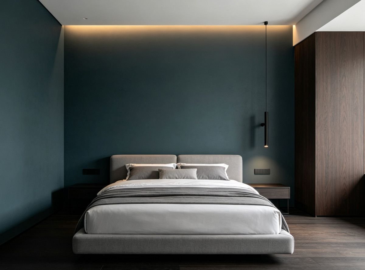
Midnight Blue is a deep, dark navy from Behr’s neutral-blue family. Its LRV is around 6, which means it absorbs almost all the light in a room. This is not a color that fades into the background. It’s a commitment.
On the wall it looks like a classic navy — think of a well-worn blazer or a clear sky just after sunset. There’s enough blue saturation to keep it from reading as black, but it’s dark enough to create real impact. It works best in rooms with good natural light or strong artificial lighting, because without enough light to catch the blue, it’ll just look very, very dark.
What Undertones Does It Have?
Midnight Blue’s base is a cool, clean blue-gray. There’s no purple or green fighting for attention — it’s straightforward in that way. The gray component keeps it from looking electric or cartoonish. It reads as a mature, grounded navy.
I pulled it up on Paintuma to see it on a wall alongside a few other dark blues. Midnight Blue sits firmly in the cool camp. Some navies lean warm with a touch of teal or indigo, but this one stays cool and slightly steely. That gray undertone is what makes it versatile — it works with both warm and cool palettes because it doesn’t push hard in either direction.
How Does Midnight Blue N480-7 Look in Different Lighting?
Lighting matters enormously with a color this dark.
In a room with strong natural light, you get the full navy. The blue reads clearly and the color has real richness. My south-facing home office hits this sweet spot, and the color looks its best from about 10 a.m. to 3 p.m.
In dim or north-facing rooms, Midnight Blue loses its blue and starts reading as near-black. You can still see the color up close, but from across the room it just looks dark. That’s not necessarily bad — some people want that moody, enveloping feel — but know what you’re signing up for.
Under warm incandescent bulbs it picks up a faint teal quality. Under cool LEDs it stays true navy. I’d recommend a mix of warm and neutral-white lighting to bring out the blue without losing the depth.
How Does It Compare to Behr Blueprint?
Blueprint S470-5 was Behr’s 2019 Color of the Year, and it’s the blue most people think of when they think Behr. But it’s a completely different animal from Midnight Blue.
Blueprint is a medium blue with an LRV around 20 — much lighter and brighter. It reads as confident and colorful but still approachable. Midnight Blue at LRV 6 is nearly four times darker on the reflectance scale. It’s a statement, not a suggestion.
If you want blue that adds color while keeping a room bright, Blueprint is the pick. If you want a room that feels enveloping — a den, a moody bedroom, a home office you want to disappear into — Midnight Blue is the bolder call. They’re not interchangeable, and that’s fine.
Does Midnight Blue N480-7 Work for Exteriors?
It does, and it’s a strong exterior choice. Dark siding has been popular for a few years running, and a deep navy reads as sharp and classic against white trim.
The main thing to know is that dark colors absorb more heat. If you’re in a hot climate and painting large sun-facing walls, that heat absorption is worth considering. In moderate climates it’s a non-issue.
Direct sunlight will lighten how Midnight Blue reads, so expect it to look a shade or two brighter outside than on your interior swatch. That’s normal for dark colors. Pair it with crisp white trim and brass or black door hardware for serious curb appeal. Use Behr’s exterior formula and plan for at least two coats — dark colors show lap marks and thin spots more than light ones.
What Trim and Accent Colors Work Best?
White trim is essential with a color this deep. Behr Ultra Pure White gives you maximum contrast and keeps the navy from feeling like a cave. If that feels too stark, a very soft warm white takes the edge off, but don’t go creamy — it’ll muddy the contrast.
I slid Midnight Blue against several accent options on Coloraw — Midnight Blue N480-7 — and warm metallics were the clear winners. Brass, gold, and warm wood tones pop against the cool navy. Soft blush pink and warm mustard also work as fabric and decor accents.
Cool silvers and grays pair cleanly if you want a more modern feel. Avoid mid-tone blues as accents — they compete with the navy rather than complement it.
What Are the Closest Matches From Other Brands?
Benjamin Moore Hale Navy HC-154 is the classic comparison. It’s a deep navy at a similar depth, but Hale Navy reads slightly warmer and richer — a touch of indigo where Midnight Blue stays cooler and grayer. They’re close, but side by side you’d spot the temperature difference.
Sherwin-Williams Naval SW 6244 is another strong match. It’s a true navy similar in depth to Midnight Blue but leans more saturated and blue-forward. Less gray in it overall.
All three are excellent dark navies. The decision comes down to undertone — cool-gray (Midnight Blue), warm-indigo (Hale Navy), or saturated-blue (Naval). Sample your top pick against white trim before committing.
Should You Sample Midnight Blue N480-7 Before Buying?
Without question. Dark colors are trickier to judge than light ones because they shift so much with the amount of light in a room. A rich navy in a well-lit showroom can look like a black hole in a dim hallway.
Paint a large swatch — at least two feet square for a dark color — and live with it for a couple of days. Check it in morning light, afternoon light, and especially at night under your actual lamps. If you want a digital preview before ordering a sample, try paintcolorvisualizer.com — it’s free, you upload a photo of your own room, and you can see the color on your walls. Works great for exterior previews too.
Bottom line: Midnight Blue N480-7 is a bold, cool-toned navy that rewards good lighting and crisp white trim. Pair it with warm metals, give it plenty of light to show off the blue, and sample it in your actual space first.