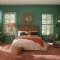
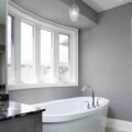
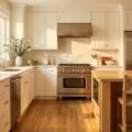
On the link between paint colors and moods, the most reliable guide is the warm-versus-cool split: warm colors such as red, orange, and yellow tend to feel energizing and social, while cool colors such as blue and green read as soothing and calming, which is why blue and green are the go-to shades for bedrooms and rooms where you unwind. The effect is real but gentle, and it varies by person, light, and culture, so the practical rule is to pick the palette that fits how you want to feel in a room, then test it on your wall before you commit.
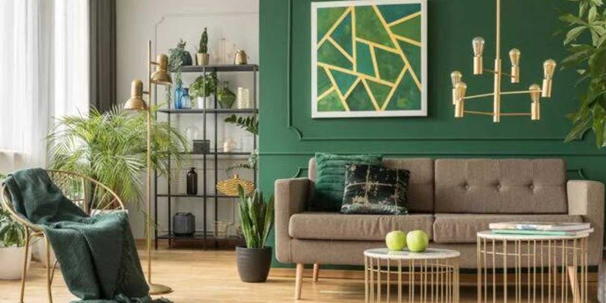
Color psychology is a young field, and the evidence is suggestive rather than certain, so this is about using a reliable starting point, not a guarantee. A room that gets the balance of warm and cool, with the 60-30-10 split and the natural light in mind, creates the mood you intended far more often than a single bold color slapped on all four walls.
Below is the color-by-mood-by-room map, the ratio that keeps a room balanced, and the pitfalls that turn a well-meant palette into a mistake.
Paint colors and moods: what the evidence shows
The evidence for paint colors and moods splits cleanly: warm colors tend to stimulate energy, appetite, and sociability, and cool colors tend to calm, lower heart rate, and aid sleep. The effects are documented but modest, and they shift with a person’s taste, the amount of color, and the light in the room, so treat the color-to-mood map as a good starting point rather than a rule.
The Mental Health America color-and-mood guide lays this out with research references: red raises energy and can quicken heart rate, orange and yellow feel vibrant and uplifting in small amounts, and green and blue lower heart rate and read as the most calming, with blue the go-to for sleep. The Sherwin-Williams color psychology guide applies the same idea to room paint specifically, tying warm hues to gathering spaces and cool to retreats. Neither claims the colors remake a person; both point at the same usable pattern, which is enough to steer a wall color.
Color by mood and by room
Match the color to the mood you want the room to carry: energize a dining room or kitchen with a warm red, orange, or yellow accent, calm a bedroom or a nursery with a soft blue, green, or pink, and ground a study or a den with a warm neutral or a green that reads balanced. The map below lines each color up with its mood, its best rooms, and the risk of overdoing it.
| Color | Mood it tends to create | Works best in | Risk of too much |
|---|---|---|---|
| Red | Energy, passion, excitement | Dining, living, accents | Can feel intense or raise tension |
| Orange | Enthusiasm, warmth, appetite | Kitchen, dining, playroom | Overstimulating in a bedroom |
| Yellow | Joy, optimism, cheer | Kitchen, entry, accents | Anxiety-inducing in large amounts |
| Green | Balance, calm, nature | Bedroom, living, study | Yellow-leaning greens can feel off |
| Blue | Calm, peace, sleep | Bedroom, bathroom, office | Dark blue can feel cold or sad |
| Purple / lavender | Relaxation, imagination | Bedroom, office | Deep purple can feel heavy |
| Pink | Softness, tenderness, calm | Nursery, bedrooms, baths | Bright pink can feel draining |
| Warm neutrals (brown, tan) | Comfort, stability, security | Den, living, entry | Too much can feel dull |
| White / gray | Clean, calm, versatile | Anywhere, base walls | Feels cold without a warmer accent |
Use the table as the quiet rule: the room’s job sets the mood, and the mood sets the family. A bedroom wants calm, so a soft blue or green with a light trim beats a bright red, while a kitchen or a dining room tolerates and even benefits from a warm accent because it is where energy and appetite live. A smaller room or a busy home can carry a bold color as an accent, and the paint colors for bedrooms: how to choose shades and the paint colors for bathrooms guides take the same logic room by room.
The 60-30-10 rule keeps a room balanced
The 60-30-10 rule gives a room balance without color fights: roughly 60 percent of the room in a dominant color, usually the walls, 30 percent in a secondary shade for larger furniture or trim, and 10 percent as an accent on a single piece or detail. Sticking to it, or to a softer version of it, keeps a mood-inducing color from overwhelming the space.
Most rooms work with the dominant color on the walls, the secondary on key furniture and the trim, and the accent on a door, a headboard, or a single wall. A bright color like yellow or red works in the 10 percent accent and turns tiring in the 60 percent, which is the mistake behind most “too much color” regrets. The ratio is a guide, not a law, and a deliberately monochrome or minimalist room can break it on purpose, but the 60-30-10 split is the safe place to start for most homes, and it is the rule the related-search traffic on the 3-color rule is really asking about.
Light, undertone, and the wall change the mood
The same color reads differently by light and by the undertone baked into it, because a north-facing room gets cool, dim light, a south-facing one gets warm, bright light, and every color carries a gray, blue, green, or beige undertone that shifts it in real life. Check the light, the wall, and the painted sample before you commit.
A soft blue that looks serene in a south-facing room can turn cold and flat on a north wall with no direct light, and a “greige” can lean gray or beige depending on the light and the furnishings around it. Paint small test patches on the actual walls, view them at morning, noon, and evening, and hold them against the floor and the furniture, because the undertone and the light change the mood more than the color name implies.
Realistic examples and the mistakes that undo them
Two realistic cases show the logic. A couple who want a calm primary bedroom choose a soft sage green for the walls, a light neutral on the trim, and a muted blue accent on the headboard, which lands in the calm, cool family and follows 60-30-10. A homeowner who wants an energetic dining room pick a warm cream field with a terracotta accent wall and a rich wood table, which gives the appetite and gathering mood without wall-to-wall red.
The common mistakes are about balance and testing. Painting all four walls of a small bedroom in a deep navy makes it feel cave-like and can read as sad rather than serene, and a bright yellow kitchen in full sunshine can feel overstimulating rather than cheerful. Ignoring the direction of the light or the undertone leads to a color that changes overnight, and skipping a real sample means trusting a card instead of the wall. Each is avoided by choosing the mood first, keeping the bold color to an accent, and testing in the actual light.
A decision checklist by homeowner profile
Decide the mood, then the color, then check the light. Name what the room should feel like, pick a warm or cool family to match, apply the 60-30-10 split, hold the choice against the light and the undertone, and test with real patches before buying cans.
- Name the mood. Calm and restful for a bedroom, focused for a study, energetic and social for a kitchen or dining room.
- Pick the family. Warm for energy, cool for calm, and use neutrals as the base that holds it together.
- Apply the ratio. About 60 percent dominant, 30 percent secondary, 10 percent accent, and put the boldest color in the smallest share.
- Check the light. Note which way the room faces and test the color at different times of day and next to the floor and furniture.
- Test on the wall. Paint a real patch on the actual surface and live with it for a day before committing to the full room.
A first-time homeowner is best served by a neutral base with a single accent, a reseller should lean on broad-appeal neutrals, and a long-term owner can take the bolder palette attached to a mood they genuinely want.
Frequently asked questions
Can paint colors affect mood? Yes, modestly. Warm colors tend to feel energizing and cool colors calming, and the color-and-mood guides note effects on heart rate, appetite, and sleep, but the response is gentle and varies by a person and the light in the room.
What colors make what moods? Warm colors such as red, orange, and yellow tend to energize and stimulate, cool colors such as blue and green tend to calm and soothe, and neutrals like white and gray read as clean and versatile. Purple and pink tend toward relaxation and tenderness.
What is the 3 color rule in interior design? The 60-30-10 rule is the common three-color guide: about 60 percent of a room in a dominant color, 30 percent in a secondary, and 10 percent as an accent. It keeps a bold or moody color from overwhelming the space.
What is the most psychologically calming color? Blue and green are the colors most often cited as calming, with blue the go-to for helping sleep and green for its association with balance and nature. Soft, muted versions calm more than bright, intense ones.
Does the light change how a paint color feels? Yes, a lot. North-facing rooms get cool, dim light and south-facing ones warm, bright light, and every color’s undertone shifts in real light, so the same shade can feel calm in one room and cold in another. Test patches in the actual room before committing.
Let the room’s purpose decide, then the light
Choose the paint color by how you want to feel in the room, trusting the warm-for-energy and cool-for-calm pattern, balance it with the 60-30-10 split, and test it in the real light and on the real wall. The psychology is gentle and personal, so the plan that works is the one that matches the mood to the room and keeps the bold tones where they belong. Once the wall is prepped and coated, the color carries the space, and the rest of the home work is in the Home Improvement guides.