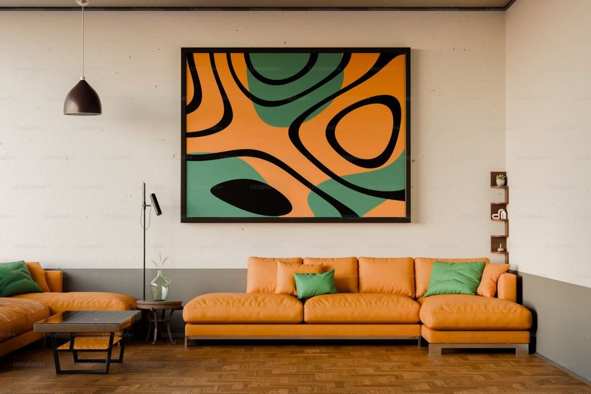
When entering a residential home or commercial workspace, the visual atmosphere influences human emotion and cognitive behavior within seconds. Beyond purely decorative aesthetics, interior paint colors serve as architectural tools that manipulate perceived room volume, regulate natural light reflectance, and set the emotional tone for daily living and productivity.
Bottom Line Up Front: Color psychology in interior design bridges sensory aesthetics and environmental psychology. Warm earthy tones foster social connection in communal gathering areas, cool muted blues and greens lower physiological stress in bedrooms and focused work zones, and strategic neutral sheens maximize light distribution while protecting underlying drywall from daily wear.
1. The Emotional and Cognitive Impact of Color Palettes
Interior designers and environmental psychologists study how wavelengths of reflected light influence heart rate, mood, and circadian rhythms. According to research highlighted by Architectural Digest Interior Color Guides, deliberate color selection directly impacts how spacious, restful, or energizing an interior environment feels to occupants.
Color Spectrum Matrix: Psychological Influence and Room Application
The table below outlines the behavioral effects, Light Reflectance Value (LRV) dynamics, and recommended room placements for primary interior paint palettes:
| Color Family | Psychological & Emotional Effect | Light Reflectance Value (LRV) | Recommended Room Application
|
| Warm Terracotta & Soft Ochre | Encourages conversation, appetite, and hospitality | Moderate (35 to 55) | Dining rooms, living spaces, and kitchen accents |
| Muted Sage & Eucalypt Green | Promotes relaxation, visual relief, and balance | Moderate to High (45 to 65) | Home offices, bedrooms, and reading corners |
| Soft Slate & Coastal Blue | Reduces pulse rate, increases focus, and soothes | Moderate (40 to 60) | Master suites, executive study rooms, and bathrooms |
| Warm Alabaster & Cream Neutrals | Expands visual boundary, clean, and versatile | High (70 to 85+) | Open-concept hallways, entryways, and small interiors |
Note: As established by the Painting and Decorating Contractors of America (PCA) Industry Standards, achieving true color fidelity requires proper surface preparation, comprehensive primer application, and minimum two-coat coverage.
2. Surface Preparation, Sheen Selection, and Indoor Air Quality
The psychological impact of interior paint depends on underlying surface condition and light-scattering sheens. Imperfections on unprimed drywall or patched areas scatter light unevenly, breaking the continuous visual rhythm of a wall. Furthermore, modern interior design prioritizes non-toxic formulations. Choosing low-VOC and zero-VOC paints compliant with the EPA Volatile Organic Compounds (VOC) Indoor Air Quality Standards ensures vibrant color application without releasing harmful gaseous emissions into closed residential rooms.
As Robert Olivares, owner of Elite 77 Painters, a professional painting contractor in Kansas City, explains, proper preparation and sheen choice define the final finish:
“A color swatch on paper looks completely different once applied to an entire room. The magic of professional painting comes down to two things: meticulous drywall preparation and understanding how light interacts with different paint sheens. Whether refinishing kitchen cabinets or transforming a master living room with warm neutrals, repairing wall blemishes and applying smooth, durable coats ensures the color delivers its intended warmth and elegance for years.”
3. Natural Light Interaction and Architectural Balance
Natural lighting conditions fundamentally alter how paint pigment renders throughout the day:
- North-Facing Rooms: Receive cool, blue-tinted natural light. Applying warm-undertone paints (creams, warm greys, soft terracottas) counteracts shadows and prevents rooms from feeling chilly.
- South-Facing Rooms: Benefit from intense, warm sunlight throughout the day. Cool undertone paints (soft greens, ocean blues, crisp off-whites) balance intense sun exposure and maintain a serene atmosphere.
- East and West Exposures: Experience drastic lighting transitions from morning brightness to warm afternoon glow, requiring versatile neutral tones that adapt across shifting color temperatures.
4. Frequently Asked Questions (Interior Color Psychology & Painting)
What paint sheen is best for living rooms versus high-moisture bathrooms?
Eggshell and satin finishes are ideal for living rooms and bedrooms because they offer soft light diffusion with easy wipeability. Bathrooms and kitchens require semi-gloss finishes to resist moisture absorption, humidity, and frequent cleaning.
How does cabinet painting and refinishing change kitchen psychology?
Cabinets occupy up to 40% of kitchen visual space. Refinishing dark, dated wood cabinets in two-tone palettes (such as warm white uppers with deep forest green or navy bases) visually opens the space while grounding the room with modern architectural character.
Summary Planning Checklist for Interior Color Transformation
- Assess Room Lighting: Determine natural light orientation (North, South, East, West) before finalizing paint undertones.
- Drywall Repair First: Patch small holes, sand rough drywall joints, and seal water stains prior to priming.
- Select Sheen for Function: Pair flat or matte sheens for ceilings, eggshell or satin for walls, and semi-gloss for trim and doors.
- Sample on Actual Walls: Test 2-foot sample patches on multiple walls to observe color shifts under morning and evening artificial lighting.